
Here’s everything about the easiest color on the eyes on a computer screen:
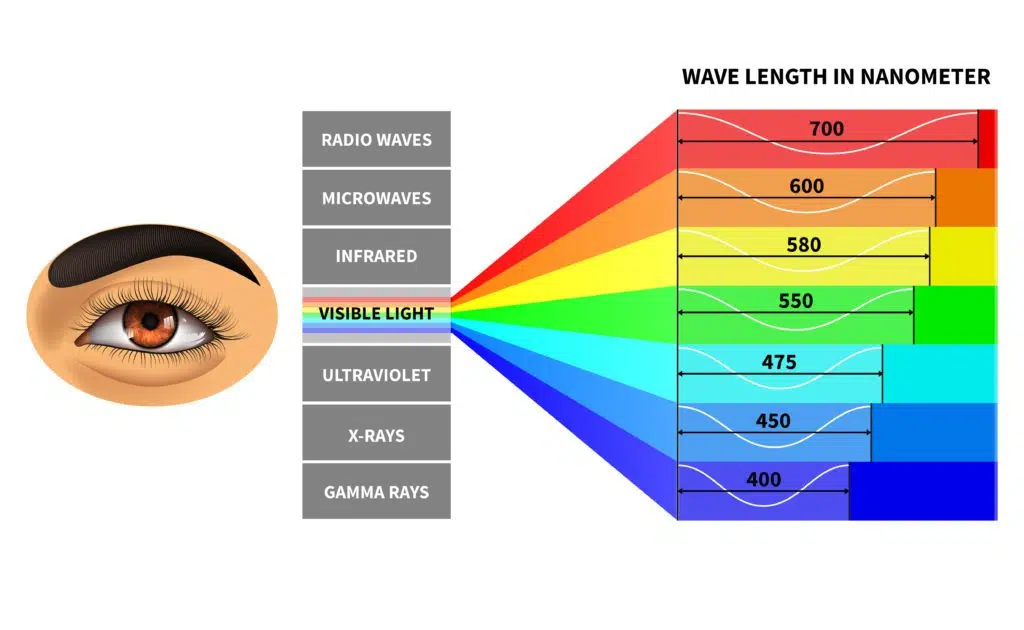
Easy on the eyes are colors in the middle of the visible color spectrum. These include red, orange, and yellow. Blue is uneasiest on the eye.
As a primary color, blue light tends to flicker more frequently than other primary colors like orange or red, and its wavelengths reach farther into the eye.
If you want to learn all about which computer screen colors are the best and worst for your eyes, then this article is for you. Let’s jump right in!
- Data Scientist Monitors: One Big and/or Two Small Monitors?
- Monitor Light Blinking: How to Fix?
- Monitor USB Ports: Purpose?
- 120 Hz vs. 144 Hz Monitors: Difference?
- All-in-One Computer as Monitor: How To?

What About the Easiest Color on the Eyes on a Computer Screen?
As beneficial as our devices may be, technology is creating health problems.
Carpal tunnel from hand movement and neck and spine issues from hunching over are two of the most noted conditions.
Even the colors on your screen are suspect.
As screens get smaller, so does the gradual damage.
There are preventive measures you can take to maximize eye health.
Let’s take a look at the most comfortable color on the eyes on a computer screen, how to manage your settings, and ways to ensure your eyes stay strain-free and healthy.
How Do Computer Screen Colors Impact Your Eyes?
Surfaces absorb colors and reflect others.
Our eyes have light receptors that transmit messages to our brain.
These transmissions produce how we perceive the wavelengths of color.
The reflected colors are what our receptors capture, and our brain creates the reds, greens, violets, etc., that we’re familiar with.
In other words, orange isn’t actually an orange color.
It’s transmitting a specific wavelength we recognize as orange.
Crazy, isn’t it?
Eyes strain results from eye muscles being forced to work harder when we’re looking at our devices.
Other elements, such as contrast and glare, can add additional stress.
What we want to do is find the best ways to minimize this damage, including finding what monitor color is easiest on the eyes.
What Is the Difference Between 120Hz and 144Hz Monitors?
Have you ever heard of Hz or hertz in relation to monitors or laptop screens?
Monitor refresh rates are measured in hertz or Hz.
Your monitor’s refresh rate indicates how often it can display a new image each second.
A 120Hz monitor displays 120 images per second, whereas a 144Hz monitor displays 144 images per second.
You should make your decision based on your budget and how serious you are about gaming.
Learn all about the difference between 120Hz and 144Hz monitors here.
What Can Blue Light Do to Your Eyes?

Your computer manages not just a spectrum of colors but their wavelengths.
Some colors in the spectrum are harder on the eyes due to their short wavelengths.
They use high energy, and that energy is transmitted into our eyes.
Blue light tends to flicker frequently, more so than other primaries like orange or red.
This is a component of our screen’s LED backlight.
This flicker is responsible for eye fatigue.
Blue wavelengths reach further into the eye, which can also cause damage to the retina.
One study showed that the impact of blue light leads to retinal and macular degeneration.
This light isn’t just coming off our mobile instruments. It emits from our LED lights and TVs, as well as fluorescent lights.
Believe it or not, the largest emitter of blue light is the sun.
How to Protect Your Eyes From Blue Light?
Some suggest we minimize our exposure to blue light by spending less time on our devices.
Let’s assume no one wants to do that!
Another option is using a screen filter.
Screen filters reduce the effects of blue light.
Find a filter specific to blue light as opposed to one that’s solely anti-glare or privacy oriented.
There are blue light glasses.
If you spend a lot of time on devices or use them late in the evening (when your exposure to blue light is higher), physicians may recommend these glasses.
What About Other Colors Than Blue Light?
What is the easiest color for the eyes to look at?
Colors in the middle of the visible spectrum are easier on the eyes. These include red, orange, and yellow.

Focus points in the eye use different criteria for different colors at different distances. The eye focuses alternatively and quickly to see many colors.
The further apart colors are on the spectrum, the greater the strain on the eye.
When this occurs, there’s more of a possibility of eye fatigue and its after-effects.
Colors on the extreme ends of the spectrum—violet, blue—are not conducive to relieving eye strain.
Though even in the case of colors like yellow, eye strain is possible if you insist on using bright settings.
So, which color is good for the eyes?
Colors should be soft, especially in backgrounds.
How to Reduce Device Strain on the Eyes? (5 Ways)

With blue light and its adverse effects in mind, make color management a priority.
Reduce your display’s color temperature.
Doing so lowers the emission of blue light and alleviates eye strain.
If you aren’t interested in computer glasses or screen filters, adjust the settings on your device.
#1 Change Color Temperatures
To offset colors to see which color is suitable for eyes, you can set color temperatures.
Default settings tend to be 5000K.
Put the default in the vicinity of 7000K, and you reduce the wavelength by almost 500 nanometers. This corresponds to 20% less exposure to blue light.
Lowering color temps may result in a reddish or yellowish display, which is beneficial.
If you work with images, video, or other visual tasks, however, you may want to change settings back to see true colors.
#2 Reduce Screen Brightness
You can adjust the level of screen brightness enough so that you can see without strain, but not so little that you still cause strain.
Drop the brightness and test it until you find a reasonable percentage.
In this manner, there’s the possibility to cut blue light emission by 70% and implement the easiest color on the eyes.
#3 Contrast
Contrast is represented by the ratio between the white and black produced on your screens.
High contrast gives the impression of increased brightness. This actually increases screen detail and makes the computer color easiest on the eyes stand out.
Setting the contrast ratio will help relax the eyes.
By turning the ratio up, you can prevent too much strain on the eyes, but don’t make the white too bright. That would be akin to staring into a light bulb—ouch!
#4 Make Things Bigger

Even if you have the desired 20/20 vision, you may still be straining your vision with colors that hurt your eyes—with no idea on your part—to see what’s on your screen.
An additional tip is to change your display size.
While the solution recommends increasing the size by 25%, you can go bigger.
You can play with these settings until you find a comfortable size for your eyes.
You can also change the scale of text and apps, resolution, and more to use what monitor color is easiest on the eyes.
#5 Resolution
You may have heard arguments about high-res solutions like 4K leading to health problems.
The issue took flight after Apple’s MacBook with Retina release in 2012.
Even The New York Daily News warned the iPad 3 could cause computer vision syndrome.
Choosing a Resolution
Resolution isn’t simply about going with 4K. It’s difficult to place a determinate figure on pixel density because not all eyes are the same.
Individual human retinas do not conveniently read and output parameters that define the best resolution in the same ways.
There is no definitive evidence that resolution influences eye strain, but maintaining a sufficient distance from your screen can minimize the possibility of damage.
Eye strain is possible regardless of resolution. Even on your smaller cell screen, manage text sizes that let you hold the device further away from your eyes.
How to Use Different Colors on Your Screen to Reduce Eye Strain?
Colors have their own traits that impact the eyes in unique ways.
These characteristics can both appeal to us and affect our vision in different ways.
The choice of colors on your screen is a matter of personal taste, but your favorite color doesn’t necessarily make it the best for your screen.
What we have to consider is the clarity and contrast of colors and matching them against foregrounds and backgrounds.
When choosing what monitor color is easiest on the eyes for your device screens, it’s essential to select a screen ambiance that’s light with eye-friendly colors that won’t force your eyes to overwork to analyze the screen.
The first step in finding out what is the easiest color on the eyes on a computer screen is knowing how to adjust your settings.
Best Color Combinations
What color screen is easiest on the eyes? You probably guessed it; black and white!
This signifies a white (easiest background color on the eyes) background with black text (the best eye-friendly font color), or vice versa.
If you prefer colors other than the recommended standards, go with a dark text on a light background.
Be sure to adjust dark and light accordingly. It’s about finding a balance.
Worst Color Combinations
Avoid dark text on dark backgrounds and low contrast text on low contrast backgrounds.
Another no-no is low contrast text on multi-color or busy backgrounds.
You may create a design cool as all get out. But you’ve designed pages that will strain the eyes.
Color Schemes That Are Easy on The Eyes
If you decide to detour away from the standard black-white scheme, look at color schemes consisting of warm or cool hues.
Warm color schemes are combinations of red, yellow, orange, and similar colors.
In physical environments, designers use cool colors to make spaces seem cozy and spacious.
Cool colors, on the other hand, remind us of ice, water, snow, and the sky.
Blue, light purple, and green soothe and calm.
Warm colors can dominate the scheme with cool components, or vice versa.
Designers can perfectly combine these colors to create the best color scheme for coding easiest on the eyes.
What Color Light Is Easiest on the Eyes at Night?

Blue light is most harmful at night, especially when you sit in the dark.
If the lighting around you is dim (this includes having the television on), you subject yourself to an advanced stage of exposure.
This is increasing the strain on your eyes even further.
Exposure to excessive blue light has been linked to insomnia.
Your eyes get overstimulated, and a disrupted nervous system won’t settle down.
You can’t sleep, so you go ahead and—dun dun dun—reach for your device!
While physicians advise that you don’t use your device at least 30 minutes before bedtime, in today’s digital age, that’s unlikely going to happen.
Instead, use the easiest color on your eyes to avoid further damage.
Best Night Color
If you want to know what color is easy on the eyes to read after dark, you’re in for a surprise.
What color is easy on the eyes at night?
Surprisingly, red.
Would you have guessed that?
Our retinas contain specialized photosensitive cells (“ipRGCs”).
They detect light and help regulate our circadian clock.
The ipRGCs are sensitive to blue wavelengths and least sensitive to red, and exposure to these wavelengths affects our sleep cycle.
What Color Scheme Should You Use For the Eyes? (4 Schemes)
You want to create the easiest color for the eyes to assure healthy screen usage.
The best step is to start with a single color in mind.
It can be your favorite color, or maybe you already have a logo or design with an established color.
Take note that despite warnings about blue light, you can indeed use blue in your schemes.
Like any color, you’ll want to keep the shades soft in the background and detail-sharp in the foreground.
#1 Color Palette
Create a complete color palette that makes for a great color scheme.
You can go online and find tools that suggest specific color palettes.
Unfortunately, the resultant palette is likely more colors than you want.
You should aim for three neutral colors for your scheme.
Our main colors consist of two shades: A base color (blue) and an accent color.
With this small set of colors, you’re more likely to create a design of color schemes easy on the eyes without going overboard and creating something that will cause strain.
#2 Your Accent Color
You use your accent color to accent (complement) the scheme.
Use a site like Paletton to find an accent color or color wheels suitable for your project.
For example, if you’re using blue, red is most likely to pop up as a good accent color because of their placements on the color wheel.
#3 Using Our Neutrals
White and grays are always an excellent addition to any color scheme.
They work with any color and ensure a decent balance of subtle differentiation.
#4 Applying the Palette
Remember, keep your lighter colors in the background.
Use darker shades for text, captions, and other forefront components.
Once you have a hierarchy, you can strategically experiment with the palette until you find the combinations and applications you like.
How to Fix a Blinking Monitor Light?
Prepare yourself for a blinking monitor.
Fixing a blinking monitor light can involve a number of different options and steps.
The goal is to isolate the root of the problem and then make repairs based on what you’ve discovered.
To try to diagnose the problem, you can test the monitor, cables, and any adapters on a computer that is working.
Learn all about the meaning of a blinking monitor light and how to fix it here.